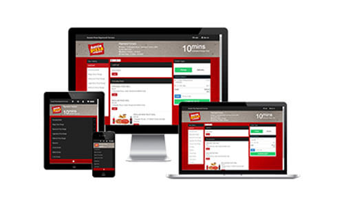
Mobile Responsive Online Ordering
Mobile optimization is becoming more and more trendy these days and it is no surprise. According to Mashable in August 2013, 17.4 percent of all global web traffic came through mobile devices and this number will continue to grow in 2014. So if you don’t want to lose your piece of the pie, it’s time to step into mobile world.
Responsive web design allows you to have a single website that automatically fits the screen size of the device on which it is being viewed. This is achieved by adapting the content, design, navigation and method of interaction to deliver the same comfort and usability to the mobile user as to the desktop user.
This means that you have just one website that looks equally well on all types of devices.